
Tag: web accessibility

  • Web Accessibility with WCAG 2.2: A Practical Delivery Guide

    Web Accessibility with WCAG 2.2: A Practical Delivery Guide

    Reviewed: 13 September 2026 · Next review: 13 December 2026
    Author: Ozlin Info Editorial Team · Human review: Lin (accountable human); Codex assisted

    Web accessibility is the practice of making digital content and functionality usable by people with a wide range of disabilities, technologies and situations. It is not a final audit checkbox. Decisions made in research, content, visual design, component design, development, procurement and maintenance all affect whether people can complete a task.

    The current W3C Recommendation is Web Content Accessibility Guidelines (WCAG) 2.2. WCAG is organised around four principles: content must be perceivable, operable, understandable and robust. A Level AA conformance claim requires every applicable Level A and Level AA success criterion to be satisfied for the full pages in scope—not an average score across selected checks (W3C — WCAG 2.2).

    WCAG is a technical standard, not a complete description of every person's experience and not, by itself, a legal opinion. An organisation should separately determine which laws, procurement rules, contracts or policies apply to its website.

    Define scope and target before changing components

    Begin with the service people need to use. Record:

    • the pages, templates, states, documents and third-party journeys in scope;
    • target users, assistive technologies and supported browsers;
    • the intended WCAG version and conformance level;
    • critical tasks such as finding information, purchasing, registering or contacting support;
    • who owns design, code, content and external widgets; and
    • how defects will be prioritised, accepted and retested.

    For a new or substantially redesigned business site, WCAG 2.2 Level AA is a sensible engineering target. It includes the earlier WCAG 2.1 criteria and adds requirements such as focus not being obscured, alternatives to dragging, minimum target size, consistent help, avoiding unnecessary repeated entry and accessible authentication. WCAG 2.2 removed the obsolete 4.1.1 Parsing criterion, although a contract or policy that explicitly names an earlier WCAG version may still require separate reporting (W3C — What's New in WCAG 2.2).

    Do not publish “WCAG compliant” based only on a home-page scanner. A formal claim has specific scope and documentation requirements, and third-party content can affect the outcome.
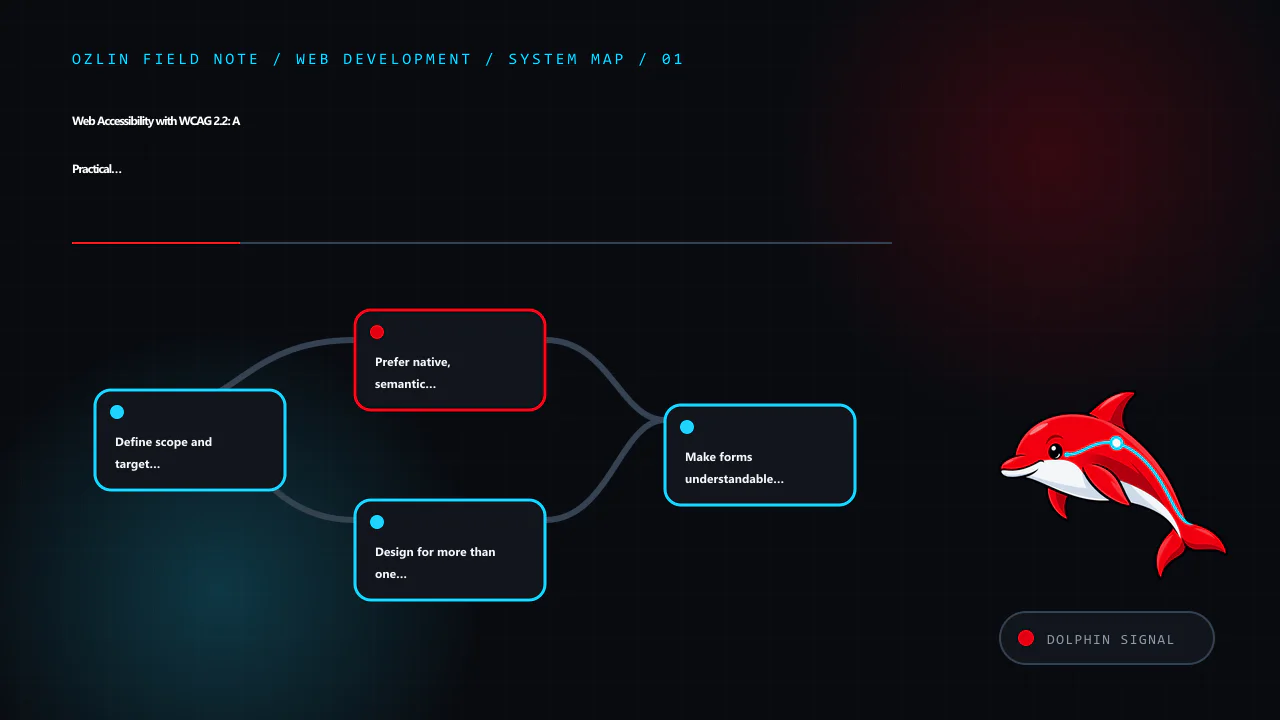
    Article map for Web Accessibility with WCAG 2.2: A Practical Delivery Guide, covering Define scope and target before changing components, Prefer native, semantic HTML, Design for more than one way to interact and relate…
    Article map: Define scope and target before changing components; Prefer native, semantic HTML; Design for more than one way to interact; Make forms understandable and recoverable.

    Prefer native, semantic HTML

    Native elements carry established keyboard and accessibility behaviour. Use a real <button> for an action, an <a href> for navigation, labelled form controls, ordered heading levels and landmarks such as header, nav, main and footer. Add ARIA only where native HTML cannot express the required name, role, state or relationship.

    A styled div with a click handler does not automatically gain button semantics, keyboard activation, focus behaviour or disabled state. Recreating these features increases code and test burden. If a custom widget is necessary, follow the appropriate WAI-ARIA Authoring Practices pattern and test the implemented behaviour; adding a role alone does not make it accessible.

    Content also needs structure and meaning:

    • give each page a descriptive title and one clear primary heading;
    • write link text that makes sense in context;
    • provide useful alternative text for informative images and empty alt text for decorative images;
    • provide captions for prerecorded video and an appropriate transcript for audio information;
    • identify the page language and language changes; and
    • present instructions and errors in text, not colour or position alone.

    Alternative text should communicate the image's purpose in that context. It is not a keyword field and does not need to describe every visible detail.

    Design for more than one way to interact

    Every interactive task should work without a mouse. Test forward and reverse keyboard navigation, logical focus order, visible focus, modal entry and exit, menus, disclosures, validation and any custom control. Focus must not be trapped or hidden behind sticky headers, cookie banners or other author-created content.

    Colour contrast matters, but colour is only one part of perceivability. Check text, controls, focus indicators and meaningful graphical objects against the applicable criterion. Do not use colour alone to communicate an error, status or selection.

    Responsive layouts must remain usable when people enlarge text or zoom. Check narrow viewports and 400% zoom for lost content, overlapping controls and two-dimensional scrolling where the criterion does not permit it. Fixed-height cards and clipped navigation often fail before the colour palette does.

    Authentication deserves particular attention. WCAG 2.2's Accessible Authentication criterion limits cognitive function tests such as memorising or transcribing information unless an alternative or assistance is available. Support password managers and paste; do not block them in the name of security without a carefully assessed reason.
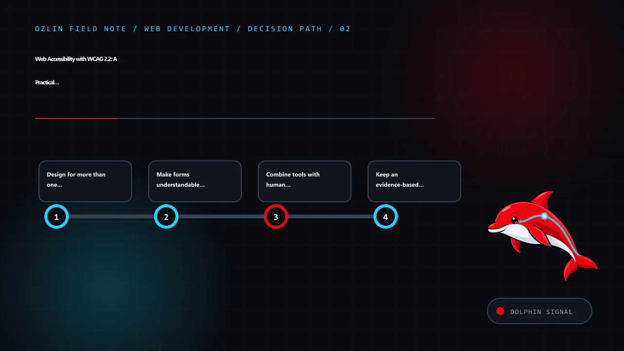
    Decision path for Web Accessibility with WCAG 2.2: A Practical Delivery Guide, covering Design for more than one way to interact, Make forms understandable and recoverable, Combine tools with human evaluation and relate…
    Decision path: Design for more than one way to interact; Make forms understandable and recoverable; Combine tools with human evaluation; Keep an evidence-based remediation backlog.

    Make forms understandable and recoverable

    Each control needs a programmatically associated, visible label. Group related radio buttons or checkboxes with fieldset and legend when appropriate. Explain required formats before they are needed and identify required fields without relying on colour alone.

    When validation fails:

    1. retain safe values the user already entered;
    2. provide a clear summary and field-specific message;
    3. associate the error with its field;
    4. move or manage focus deliberately so the error is discoverable; and
    5. tell the user how to correct it.

    For an asynchronous submission, expose the result as a programmatically determinable status message. Do not unexpectedly move focus for every small update.

    Combine tools with human evaluation

    Automated tools are useful for repeatable checks such as missing accessible names, some contrast failures and certain invalid relationships. They cannot reliably judge whether alternative text is meaningful, focus order follows the task, instructions make sense or a screen-reader experience is coherent. W3C explicitly says no tool alone can determine whether a site meets accessibility guidelines (W3C — Introduction to Web Accessibility).

    A practical test set includes:

    Method What it can reveal
    Automated rules in CI Repeatable detectable regressions across known templates
    Keyboard-only walkthrough Reachability, order, traps, focus visibility and operability
    Zoom and reflow checks Clipping, overlap, loss of content and excessive scrolling
    Screen-reader checks Names, roles, headings, landmarks, reading order, status and errors
    High-contrast or forced-colour checks Information lost when authored colours are overridden
    Content review Heading logic, link purpose, instructions, captions and alternatives
    Disabled-user evaluation Barriers, workarounds and priorities that technical inspection can miss

    Test representative pages and every distinct component or state, not just URLs selected at random. Include errors, empty results, loading, authentication, session expiry and third-party flows. W3C's Easy Checks are a useful first review but are explicitly not exhaustive (W3C — Easy Checks).
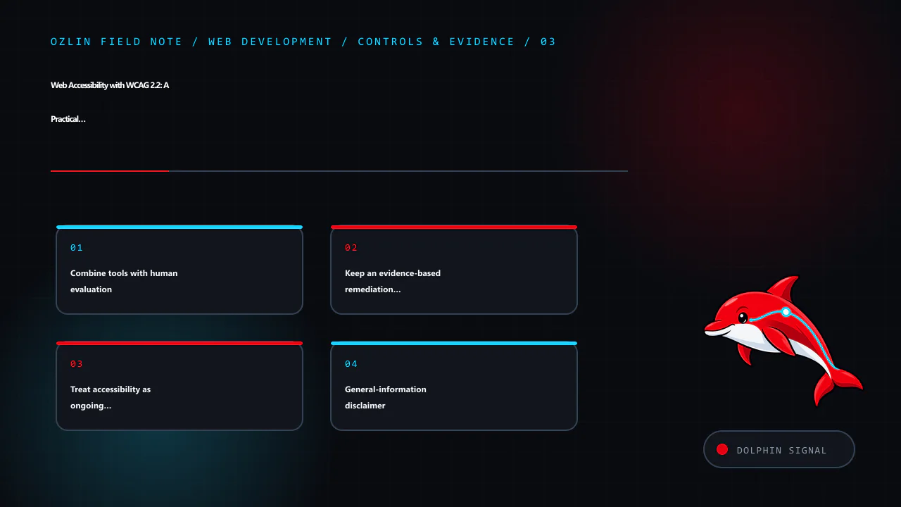
    Control and evidence map for Web Accessibility with WCAG 2.2: A Practical Delivery Guide, covering Combine tools with human evaluation, Keep an evidence-based remediation backlog, Treat accessibility as ongoing quality…
    Control and evidence map: Combine tools with human evaluation; Keep an evidence-based remediation backlog; Treat accessibility as ongoing quality; General-information disclaimer.

    Keep an evidence-based remediation backlog

    Record each finding with the affected task, URL or component, WCAG criterion, reproducible steps, observed and expected behaviour, severity, owner, target release and retest evidence. Prioritise barriers that block critical tasks, affect many pages or create safety, privacy or financial consequences.

    Reusable components create leverage: correcting a shared navigation, dialog, form field or error summary can remove the same barrier across many pages. Add a regression test where automation is reliable, but retain manual checks in the definition of done.

    An accessibility statement should be accurate about scope, known limitations and contact paths. It should not claim perfection or replace a working way for people to report a barrier. Give accessibility reports an owner and response process.

    Treat accessibility as ongoing quality

    Content edits, plugin updates, third-party scripts and new features can reintroduce barriers. Review accessibility during discovery and design, test components before release, run automated rules in continuous integration and schedule periodic task-based evaluation. Train the people who publish content as well as the developers who build templates.

    For help reviewing a website workflow, component library or remediation backlog, see Ozlin Info's web development services or contact Ozlin Info.

    Related reading: 10 WordPress performance checks before optimisation.
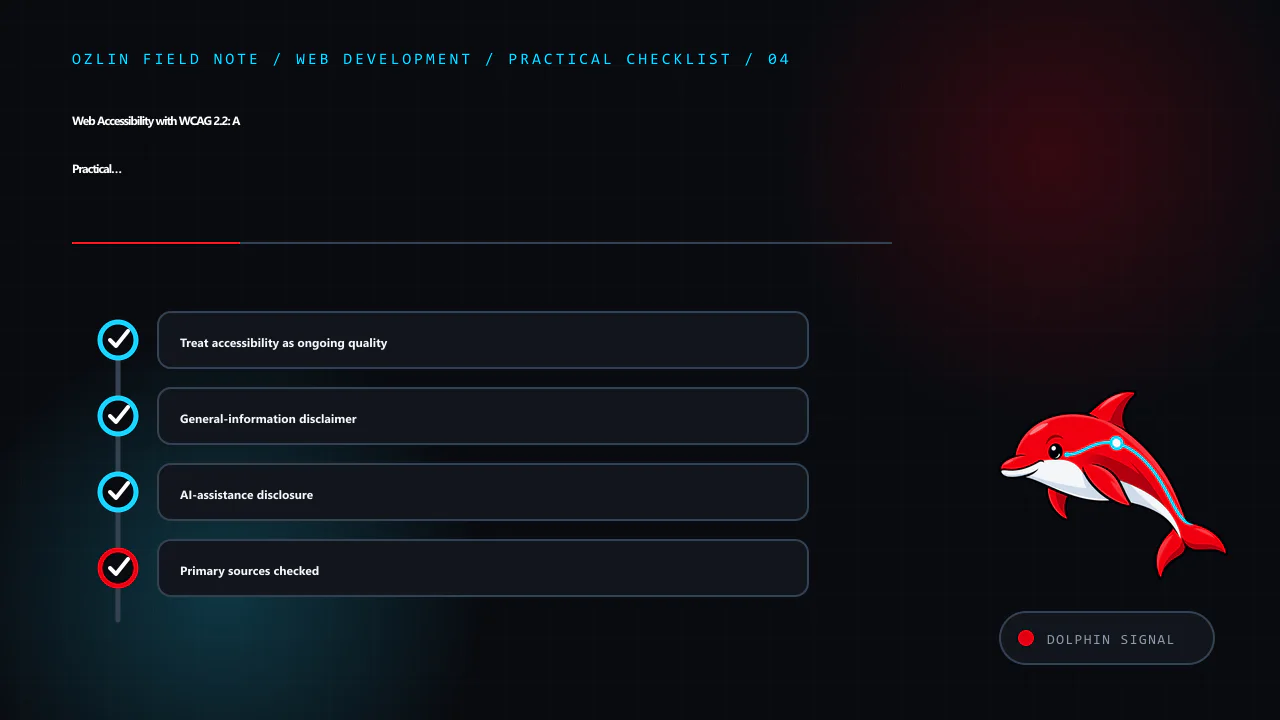

    Practical checklist for Web Accessibility with WCAG 2.2: A Practical Delivery Guide, covering Treat accessibility as ongoing quality, General-information disclaimer, AI-assistance disclosure and related review points.
    Practical checklist: Treat accessibility as ongoing quality; General-information disclaimer; AI-assistance disclosure; Primary sources checked.

    General-information disclaimer

    This article provides general technical information only. It is not legal, regulatory, procurement or accessibility-conformance advice. A conformance claim requires evaluation of the complete defined scope against the relevant standard and may require qualified legal or accessibility advice.

    AI-assistance disclosure

    AI tools assisted with source discovery, outlining and copyediting. The recorded editorial review and review schedule appear at the start of this article. Verify current sources and project-specific assumptions before relying on this guidance. Automated or AI-assisted checks do not prove accessibility or WCAG conformance.

    Primary sources checked

    Source access date: 29 August 2026.

    Limitations: Accessibility conformance depends on the defined scope, user journeys, assistive technologies and testing; this is not a conformance claim or legal advice.

  • CSS Grid for Responsive Layouts: Structure Without Source-Order Tricks

    CSS Grid for Responsive Layouts: Structure Without Source-Order Tricks

    CSS Grid is a two-dimensional layout system for rows and columns. It is well suited to page regions, card collections, dashboards and components where alignment in both axes matters. The difficult part is not learning display: grid; it is choosing track rules that respond to content without hiding overflow, reordering meaning or creating brittle breakpoints.

    Start with semantic HTML in the order people should read and operate it. Use Grid to present that structure, not to repair a confusing document tree.

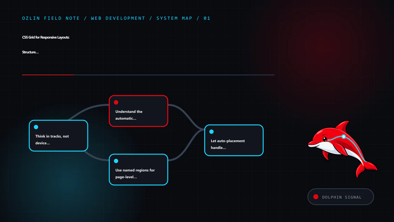
    Article map for CSS Grid for Responsive Layouts: Structure Without Source-Order Tricks, covering Think in tracks, not device categories, Understand the automatic minimum, Use named regions for page-level clarity and rel…
    Article map: Think in tracks, not device categories; Understand the automatic minimum; Use named regions for page-level clarity; Let auto-placement handle repeated content.

    Think in tracks, not device categories

    A grid container defines columns and rows. Items occupy grid cells and may span more than one track. Flexible fr units divide remaining space, while intrinsic keywords and minmax() let content influence track sizing.

    For a card collection that should use as many sensible columns as fit:

    .card-grid {
      display: grid;
      grid-template-columns: repeat(auto-fit, minmax(min(100%, 18rem), 1fr));
      gap: clamp(1rem, 2vw, 1.75rem);
    }

    auto-fit creates repeated tracks and collapses empty ones. minmax() sets a lower and upper sizing rule, while min(100%, 18rem) prevents the minimum from forcing horizontal overflow in a container narrower than 18rem. The W3C Grid specification defines auto-fit, auto-fill, intrinsic track sizes and flexible lengths in the track sizing model (W3C — CSS Grid Layout Module Level 2).

    This content-led rule often removes several viewport breakpoints. It does not remove the need to test long words, translated text, zoom, narrow containers and unusually large content.

    Understand the automatic minimum

    A 1fr track is not always equivalent to minmax(0, 1fr). Grid items can contribute an automatic minimum based on their content, so a long unbreakable string or wide child can force overflow.

    For application layouts where a flexible track must be allowed to shrink, use:

    .app-shell {
      display: grid;
      grid-template-columns: minmax(0, 1fr) minmax(16rem, 24rem);
    }
    
    .app-shell > * {
      min-width: 0;
    }

    Do not apply overflow: hidden everywhere to disguise the symptom. That can clip focus indicators, menus and content. Fix the sizing constraint and define wrapping or scrolling for the component that genuinely needs it.

    Use named regions for page-level clarity

    Named grid areas can make a stable page composition easy to read:

    .page {
      display: grid;
      grid-template-areas:
        "header header"
        "main   aside"
        "footer footer";
      grid-template-columns: minmax(0, 1fr) minmax(16rem, 22rem);
      gap: 1.5rem;
    }
    
    .site-header { grid-area: header; }
    .main-content { grid-area: main; }
    .sidebar { grid-area: aside; }
    .site-footer { grid-area: footer; }
    
    @media (max-width: 48rem) {
      .page {
        grid-template-areas:
          "header"
          "main"
          "aside"
          "footer";
        grid-template-columns: minmax(0, 1fr);
      }
    }

    The breakpoint belongs to this layout's content, not a device brand. Test it at zoom and with the sidebar's longest realistic content.

    Grid areas can visually rearrange content, but CSS does not generally change the DOM reading or keyboard focus order. A visual sidebar that appears before the main content while remaining later in the DOM can confuse people who navigate sequentially. Keep the source order meaningful at every layout and avoid the order property or explicit placements that create a mismatch.

    Let auto-placement handle repeated content

    For a homogeneous list of cards, allow normal auto-placement rather than assigning coordinates to every item. The default row-flow follows source order. grid-auto-flow: dense can backfill visual gaps, but it may display a later item before an earlier one. That is risky when sequence matters, including articles, products, form steps and keyboard-focusable cards.

    Use dense packing only when every item is truly independent and verify reading, focus and visual order.

    If one featured item spans tracks, apply an explicit class based on content meaning, not an :nth-child() rule that changes unpredictably when editors add items.

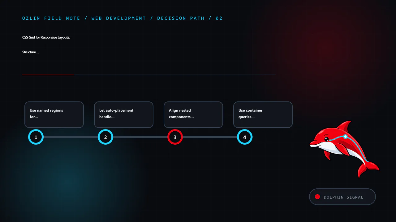
    Decision path for CSS Grid for Responsive Layouts: Structure Without Source-Order Tricks, covering Use named regions for page-level clarity, Let auto-placement handle repeated content, Align nested components with subgr…
    Decision path: Use named regions for page-level clarity; Let auto-placement handle repeated content; Align nested components with subgrid; Use container queries for component context.

    Align nested components with subgrid

    Without subgrid, each card calculates its own internal rows. Headings of different length can move summaries and actions out of alignment. A nested grid using subgrid can inherit the parent track definition:

    .pricing-grid {
      display: grid;
      grid-template-columns: repeat(auto-fit, minmax(min(100%, 17rem), 1fr));
      gap: 1rem;
    }
    
    .pricing-card {
      display: grid;
      grid-template-rows: subgrid;
      grid-row: span 4;
    }

    Subgrid participates in the sizing of the parent tracks, which is useful for aligned headings, feature lists and calls to action. Check the browser baseline required by the project and provide a reasonable non-subgrid layout where older embedded browsers remain in scope.

    Use container queries for component context

    Viewport media queries answer how wide the browser is. A component may appear in a full page, sidebar or modal within the same viewport. Container queries can adapt it to the space its parent provides:

    .profile-module {
      container-type: inline-size;
    }
    
    @container (min-width: 36rem) {
      .profile-card {
        grid-template-columns: 8rem minmax(0, 1fr);
      }
    }

    Grid and container queries solve different problems: Grid distributes space; a container query switches rules based on an ancestor's size. Use the smallest number of state changes that the component actually needs.

    Choose Grid, Flexbox or normal flow by relationship

    Use normal block and inline flow for text and simple documents. Use Flexbox where one-dimensional distribution and alignment is primary, such as a toolbar or button group. Use Grid where rows and columns form a meaningful two-dimensional relationship.

    They work together. A page can use Grid for regions, Flexbox for navigation controls and normal flow inside an article. Avoid turning every wrapper into a layout context; each level adds constraints and debugging work.

    Keep spacing and sizing resilient

    Prefer gap for space between grid tracks rather than margins that components must know how to cancel. Use clamp() for bounded fluid values where continuous scaling makes sense. Combine relative units with readable maximum line lengths.

    Do not fix card heights to make a screenshot align. Fixed heights break with larger text, localisation and user styles. Use track alignment and let content determine height. If a section legitimately scrolls, give it a visible boundary, keyboard access and an accessible name where needed.

    Images should have intrinsic dimensions or an aspect ratio so the grid does not move after they load. Use object-fit only when cropping is acceptable and make sure important content is not lost at different aspect ratios.

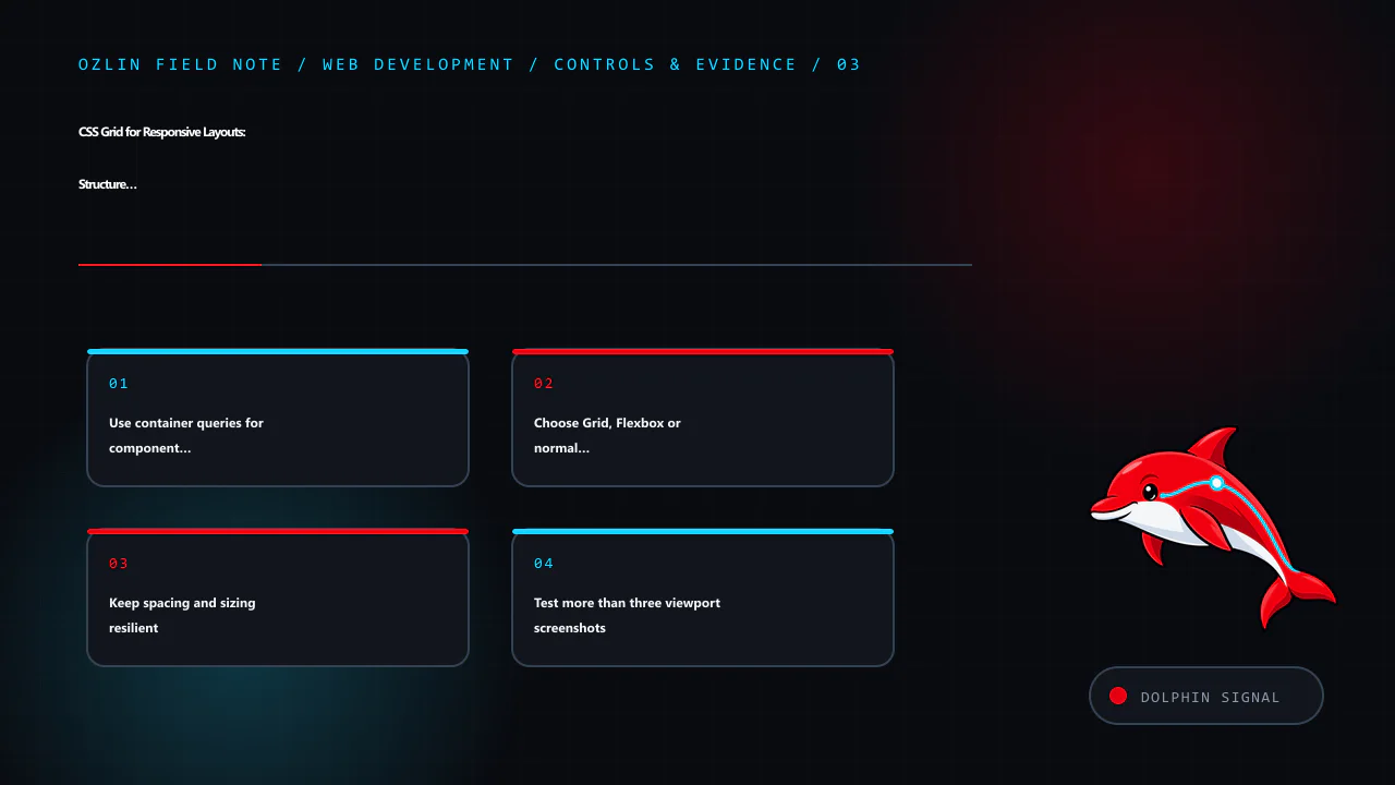
    Control and evidence map for CSS Grid for Responsive Layouts: Structure Without Source-Order Tricks, covering Use container queries for component context, Choose Grid, Flexbox or normal flow by relationship, Keep spacin…
    Control and evidence map: Use container queries for component context; Choose Grid, Flexbox or normal flow by relationship; Keep spacing and sizing resilient; Test more than three viewport screenshots.

    Test more than three viewport screenshots

    A robust layout test includes:

    • narrow and wide containers, including component reuse;
    • 200% text enlargement and 400% browser zoom;
    • long headings, URLs and untranslated strings;
    • missing images, short content and very long content;
    • right-to-left direction where relevant;
    • keyboard focus indicators near clipped or overlapping regions;
    • browser minimums in the support policy; and
    • print or reduced-motion modes where the service needs them.

    Use browser development tools to inspect grid lines and track sizing, but verify through real content and assistive-technology tasks. A visually aligned grid is not automatically a usable information hierarchy.

    For help implementing a responsive design system or repairing a brittle layout, see Ozlin Info's web development services or contact Ozlin Info.

    Related reading: Web accessibility with WCAG 2.2: a practical delivery guide.


    General-information disclaimer

    This article provides general technical information only. CSS behaviour and support must be tested against the project's actual browsers, content, accessibility requirements and component contexts.

    AI-assistance disclosure

    AI tools assisted with source discovery, outlining and copyediting. A human reviewer must run every code example, test the target browser matrix and verify service claims and the publication decision before release. No cross-browser or accessibility outcome is guaranteed.

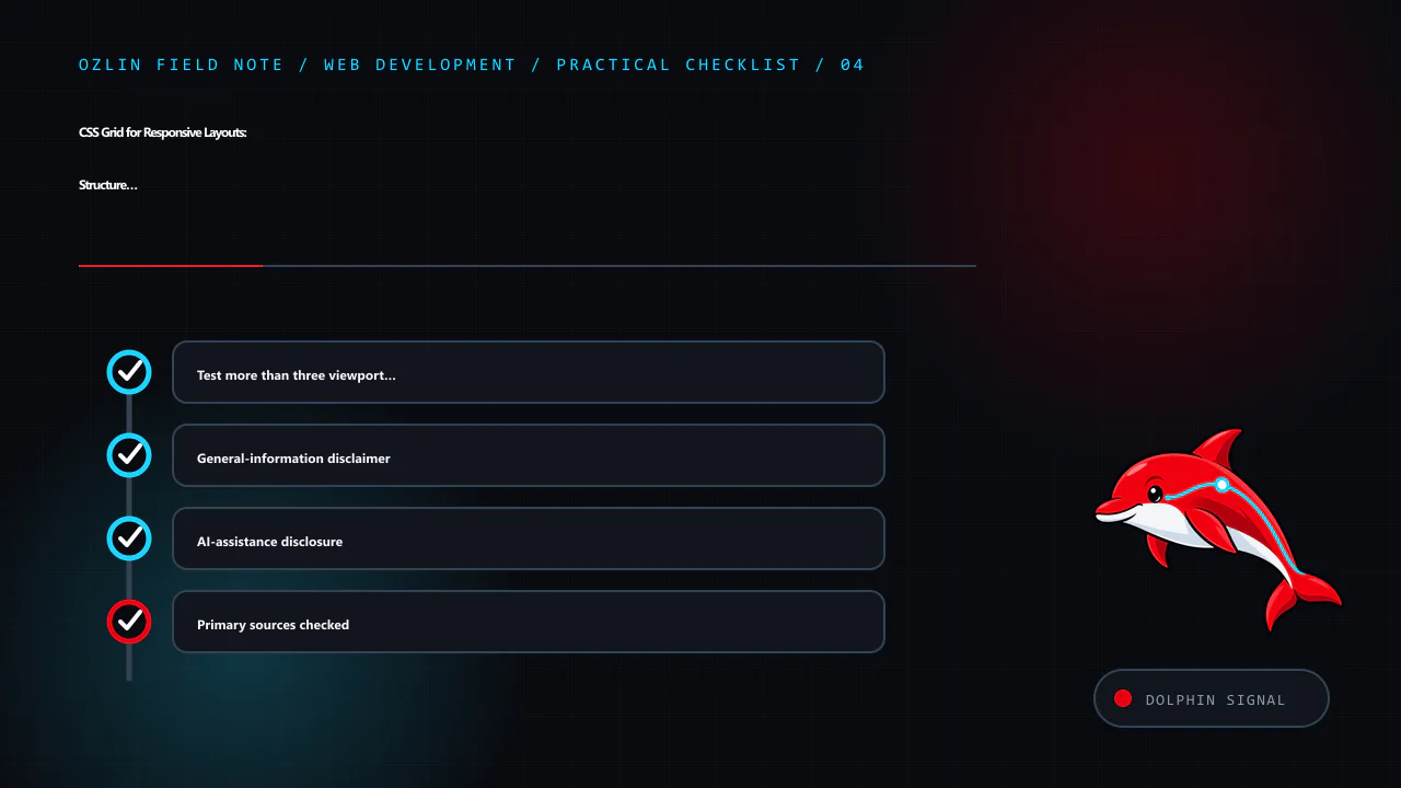
    Practical checklist for CSS Grid for Responsive Layouts: Structure Without Source-Order Tricks, covering Test more than three viewport screenshots, General-information disclaimer, AI-assistance disclosure and related re…
    Practical checklist: Test more than three viewport screenshots; General-information disclaimer; AI-assistance disclosure; Primary sources checked.

    Primary sources checked

    Source access date: 29 August 2026.