

CSS Grid is a two-dimensional layout system for rows and columns. It is well suited to page regions, card collections, dashboards and components where alignment in both axes matters. The difficult part is not learning display: grid; it is choosing track rules that respond to content without hiding overflow, reordering meaning or creating brittle breakpoints.
Start with semantic HTML in the order people should read and operate it. Use Grid to present that structure, not to repair a confusing document tree.
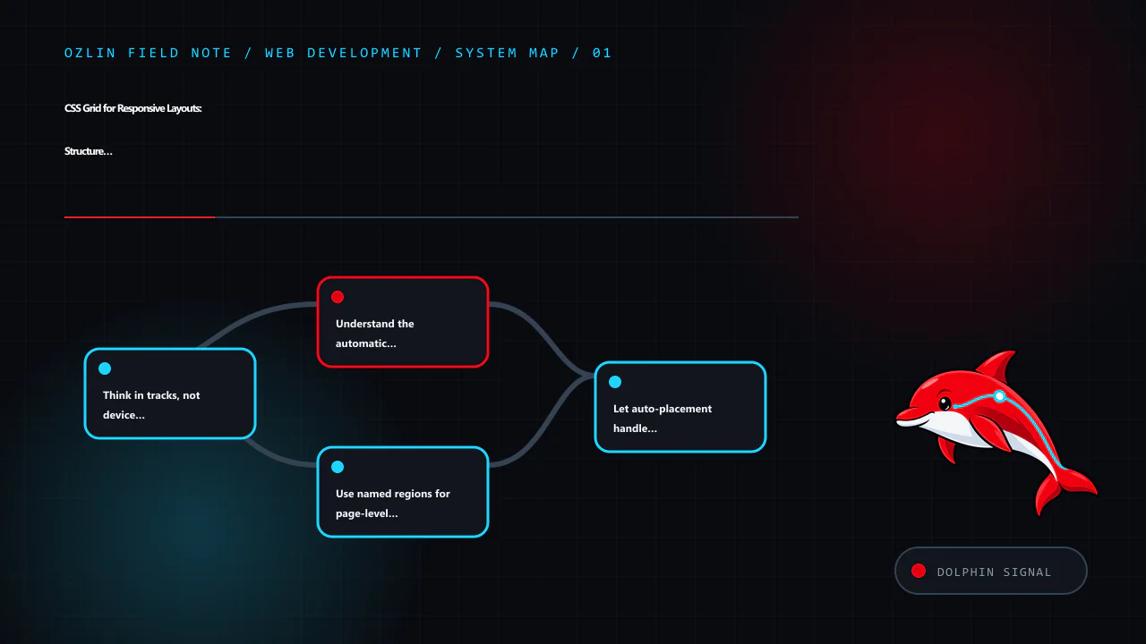
Think in tracks, not device categories
A grid container defines columns and rows. Items occupy grid cells and may span more than one track. Flexible fr units divide remaining space, while intrinsic keywords and minmax() let content influence track sizing.
For a card collection that should use as many sensible columns as fit:
.card-grid {
  display: grid;
  grid-template-columns: repeat(auto-fit, minmax(min(100%, 18rem), 1fr));
  gap: clamp(1rem, 2vw, 1.75rem);
}
auto-fit creates repeated tracks and collapses empty ones. minmax() sets a lower and upper sizing rule, while min(100%, 18rem) prevents the minimum from forcing horizontal overflow in a container narrower than 18rem. The W3C Grid specification defines auto-fit, auto-fill, intrinsic track sizes and flexible lengths in the track sizing model (W3C — CSS Grid Layout Module Level 2).
This content-led rule often removes several viewport breakpoints. It does not remove the need to test long words, translated text, zoom, narrow containers and unusually large content.
Understand the automatic minimum
A 1fr track is not always equivalent to minmax(0, 1fr). Grid items can contribute an automatic minimum based on their content, so a long unbreakable string or wide child can force overflow.
For application layouts where a flexible track must be allowed to shrink, use:
.app-shell {
  display: grid;
  grid-template-columns: minmax(0, 1fr) minmax(16rem, 24rem);
}

.app-shell > * {
  min-width: 0;
}
Do not apply overflow: hidden everywhere to disguise the symptom. That can clip focus indicators, menus and content. Fix the sizing constraint and define wrapping or scrolling for the component that genuinely needs it.
Use named regions for page-level clarity
Named grid areas can make a stable page composition easy to read:
.page {
  display: grid;
  grid-template-areas:
    "header header"
    "main   aside"
    "footer footer";
  grid-template-columns: minmax(0, 1fr) minmax(16rem, 22rem);
  gap: 1.5rem;
}

.site-header { grid-area: header; }
.main-content { grid-area: main; }
.sidebar { grid-area: aside; }
.site-footer { grid-area: footer; }

@media (max-width: 48rem) {
  .page {
    grid-template-areas:
      "header"
      "main"
      "aside"
      "footer";
    grid-template-columns: minmax(0, 1fr);
  }
}
The breakpoint belongs to this layout's content, not a device brand. Test it at zoom and with the sidebar's longest realistic content.
Grid areas can visually rearrange content, but CSS does not generally change the DOM reading or keyboard focus order. A visual sidebar that appears before the main content while remaining later in the DOM can confuse people who navigate sequentially. Keep the source order meaningful at every layout and avoid the order property or explicit placements that create a mismatch.
Let auto-placement handle repeated content
For a homogeneous list of cards, allow normal auto-placement rather than assigning coordinates to every item. The default row-flow follows source order. grid-auto-flow: dense can backfill visual gaps, but it may display a later item before an earlier one. That is risky when sequence matters, including articles, products, form steps and keyboard-focusable cards.
Use dense packing only when every item is truly independent and verify reading, focus and visual order.
If one featured item spans tracks, apply an explicit class based on content meaning, not an :nth-child() rule that changes unpredictably when editors add items.
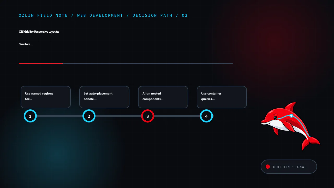
Align nested components with subgrid
Without subgrid, each card calculates its own internal rows. Headings of different length can move summaries and actions out of alignment. A nested grid using subgrid can inherit the parent track definition:
.pricing-grid {
  display: grid;
  grid-template-columns: repeat(auto-fit, minmax(min(100%, 17rem), 1fr));
  gap: 1rem;
}

.pricing-card {
  display: grid;
  grid-template-rows: subgrid;
  grid-row: span 4;
}
Subgrid participates in the sizing of the parent tracks, which is useful for aligned headings, feature lists and calls to action. Check the browser baseline required by the project and provide a reasonable non-subgrid layout where older embedded browsers remain in scope.
Use container queries for component context
Viewport media queries answer how wide the browser is. A component may appear in a full page, sidebar or modal within the same viewport. Container queries can adapt it to the space its parent provides:
.profile-module {
  container-type: inline-size;
}

@container (min-width: 36rem) {
  .profile-card {
    grid-template-columns: 8rem minmax(0, 1fr);
  }
}
Grid and container queries solve different problems: Grid distributes space; a container query switches rules based on an ancestor's size. Use the smallest number of state changes that the component actually needs.
Choose Grid, Flexbox or normal flow by relationship
Use normal block and inline flow for text and simple documents. Use Flexbox where one-dimensional distribution and alignment is primary, such as a toolbar or button group. Use Grid where rows and columns form a meaningful two-dimensional relationship.
They work together. A page can use Grid for regions, Flexbox for navigation controls and normal flow inside an article. Avoid turning every wrapper into a layout context; each level adds constraints and debugging work.
Keep spacing and sizing resilient
Prefer gap for space between grid tracks rather than margins that components must know how to cancel. Use clamp() for bounded fluid values where continuous scaling makes sense. Combine relative units with readable maximum line lengths.
Do not fix card heights to make a screenshot align. Fixed heights break with larger text, localisation and user styles. Use track alignment and let content determine height. If a section legitimately scrolls, give it a visible boundary, keyboard access and an accessible name where needed.
Images should have intrinsic dimensions or an aspect ratio so the grid does not move after they load. Use object-fit only when cropping is acceptable and make sure important content is not lost at different aspect ratios.
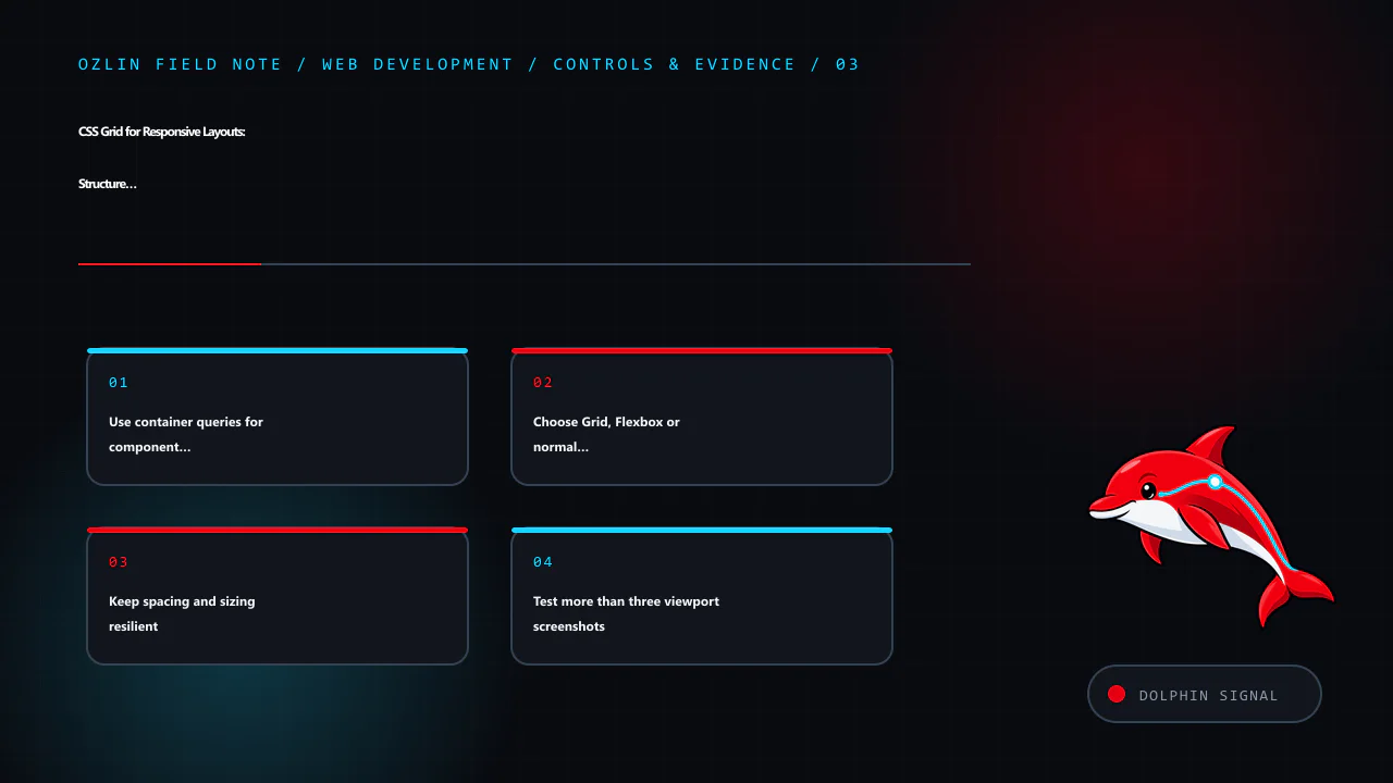
Test more than three viewport screenshots
A robust layout test includes:
- narrow and wide containers, including component reuse;
- 200% text enlargement and 400% browser zoom;
- long headings, URLs and untranslated strings;
- missing images, short content and very long content;
- right-to-left direction where relevant;
- keyboard focus indicators near clipped or overlapping regions;
- browser minimums in the support policy; and
- print or reduced-motion modes where the service needs them.
Use browser development tools to inspect grid lines and track sizing, but verify through real content and assistive-technology tasks. A visually aligned grid is not automatically a usable information hierarchy.
For help implementing a responsive design system or repairing a brittle layout, see Ozlin Info's web development services or contact Ozlin Info.
Related reading: Web accessibility with WCAG 2.2: a practical delivery guide.
General-information disclaimer
This article provides general technical information only. CSS behaviour and support must be tested against the project's actual browsers, content, accessibility requirements and component contexts.
AI-assistance disclosure
AI tools assisted with source discovery, outlining and copyediting. A human reviewer must run every code example, test the target browser matrix and verify service claims and the publication decision before release. No cross-browser or accessibility outcome is guaranteed.
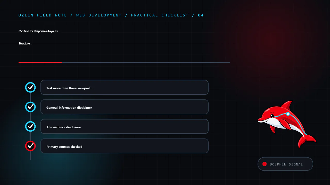
Primary sources checked
- W3C — CSS Grid Layout Module Level 2
- MDN — CSS Grid Layout
- MDN — Basic Concepts of Grid Layout
- MDN — Subgrid
- MDN — CSS Container Queries
Source access date: 29 August 2026.
Leave a Reply