
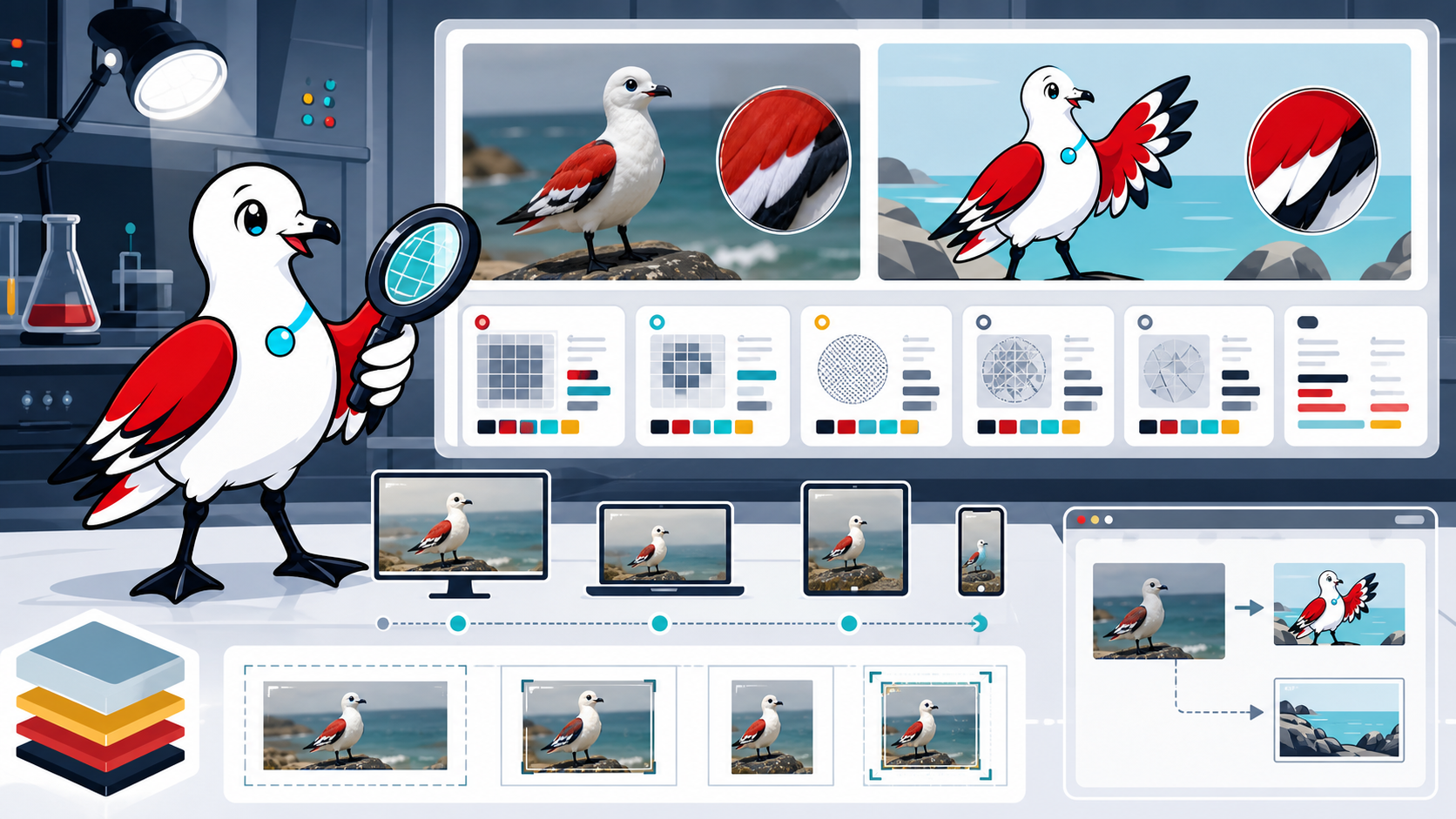
Modern image formats can reduce page weight, but “convert everything to WebP” is not a complete optimisation plan. The best result depends on the source, content, required fidelity, encoder settings, rendered dimensions, target browsers and how quickly the browser can discover and decode the image.
WebP and AVIF support lossy and lossless use cases, transparency and animation. JPEG, PNG and SVG remain useful. Choose by evidence for each image class, not a universal percentage copied from a codec comparison.
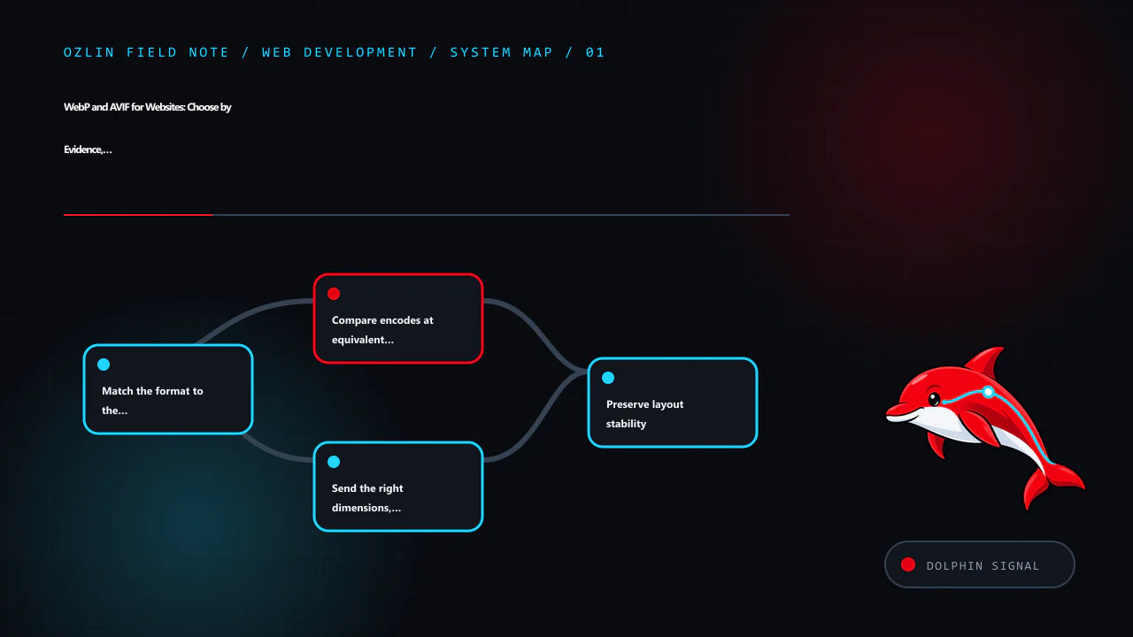
Match the format to the content
Start with what the asset contains and what must be preserved:
| Content | Candidates | Review points |
|---|---|---|
| Photograph | AVIF, WebP, JPEG | Texture, gradients, faces, colour, encode/decode cost |
| Screenshot or mixed UI | Lossless/near-lossless WebP, PNG, sometimes AVIF | Text edges, small icons, colour accuracy |
| Logo or geometric icon | SVG where safely produced | Scalability, accessibility, script/external references |
| Transparency | AVIF, WebP, PNG, SVG | Edge quality and whether lossless alpha is required |
| Animation | Video is often better; animated AVIF/WebP where justified | Controls, motion preference, CPU, bytes and fallback |
web.dev recommends JPEG, lossy WebP or AVIF for photographic material and notes that lossless WebP may be more efficient than PNG for some assets. It also warns that text should generally remain real text rather than being embedded in an image (web.dev — Choose the Right Image Format).
SVG is a document format, not just compressed pixels. Optimise and sanitise untrusted SVG, avoid embedding secrets or unnecessary metadata and test how it is served. A raster image may be safer when the publication workflow cannot control SVG content.
Compare encodes at equivalent visual acceptability
Google's WebP documentation reports codec-level comparisons against PNG and JPEG, but those figures come from particular datasets and metrics; they are not a promise for every site (Google — An Image Format for the Web). Your source may compress better or worse.
For each representative asset:
- begin with the highest-quality available source, not a previously compressed thumbnail;
- generate several candidate quality levels and target widths;
- compare difficult areas at the actual rendered size and high-density display;
- record bytes and visual acceptance;
- profile decode and paint where the image is performance-critical; and
- keep the source and encoding settings so the result is reproducible.
Do not repeatedly decode and re-encode lossy files. Generational loss accumulates. Keep archival originals outside the web delivery directory with appropriate access and backup controls.
AVIF can produce very small files for some photographs, but encoder effort, decode behaviour and artefacts vary. WebP may be a better operational choice for another asset. A smaller file that takes longer to become displayable can still hurt a critical image on a low-powered device; test the actual page.
Send the right dimensions, not only a new codec
Serving a 3000-pixel source into a 400-pixel card wastes bytes even if the file is AVIF. Create width candidates and let the browser select based on the rendered slot and device density:
<picture>
  <source
    type="image/avif"
    srcset="hero-640.avif 640w, hero-1280.avif 1280w, hero-1920.avif 1920w"
    sizes="(max-width: 48rem) 100vw, 72rem">
  <source
    type="image/webp"
    srcset="hero-640.webp 640w, hero-1280.webp 1280w, hero-1920.webp 1920w"
    sizes="(max-width: 48rem) 100vw, 72rem">
  <img
    src="hero-1280.jpg"
    srcset="hero-640.jpg 640w, hero-1280.jpg 1280w, hero-1920.jpg 1920w"
    sizes="(max-width: 48rem) 100vw, 72rem"
    width="1920"
    height="1080"
    alt="Team reviewing a website interface around one table">
</picture>
The browser evaluates type, srcset, sizes, viewport and device density to choose a candidate. The <img> remains the fallback and owns the alternative text and intrinsic dimensions (MDN — The Picture Element).
The sizes value describes the rendered slot, not the image file width. Incorrect sizes can make the browser choose a larger candidate than necessary. Inspect real network requests at several viewport sizes.
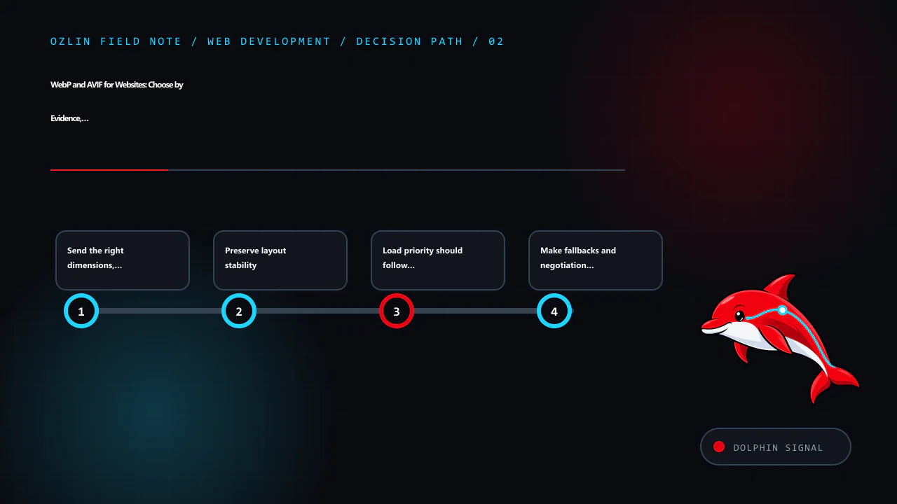
Preserve layout stability
Set correct width and height attributes or a CSS aspect-ratio so the browser can reserve space before the image arrives. This reduces unexpected layout movement. CSS can still scale the image responsively:
img {
  max-width: 100%;
  height: auto;
}
If art direction uses different crops with different aspect ratios, ensure each source and layout provides an appropriate reserved space. object-fit: cover crops content; verify that the focal subject and any meaningful details remain visible.
Load priority should follow page role
The main above-the-fold image may be the page's Largest Contentful Paint element. Put it in initial HTML, avoid lazy-loading it and consider an appropriate fetch priority only after inspecting the waterfall. Below-the-fold images can use loading="lazy" where that behaviour fits.
Do not add loading="lazy" to every image through a blanket string replacement. Logos, primary content and immediately visible thumbnails may need normal discovery. Likewise, preloading many images competes with CSS, fonts and scripts.
The decoding attribute is a hint, not a performance guarantee. Measure on target pages and devices.
Make fallbacks and negotiation cache-safe
The <picture> element puts format selection in the browser and works well with static files. A CDN or server can also negotiate based on request headers, but the cache key must include the relevant variant. Incorrect Vary or CDN rules can send an unsupported or wrong representation.
Use distinct URLs for transformed variants where practical, long-lived caching for immutable filenames and an image pipeline that regenerates all required widths when the original changes. Do not keep generating nearly identical variants without retention and storage controls.
Modern browsers broadly support WebP and AVIF, but embedded web views, email clients, social scrapers and the project's declared support matrix may differ. A fallback is inexpensive insurance where those clients matter. Test sharing previews and feeds as well as the visible page.
Integrate with WordPress deliberately
WordPress can generate intermediate image sizes and may produce supported modern formats depending on server libraries, configuration and plugins. Verify which files are actually created, which URLs appear in srcset, and whether offload or optimisation plugins preserve alt text, dimensions, cache invalidation and originals.
Before bulk conversion:
- make a recoverable backup of the media library and database;
- test representative photos, screenshots, transparent assets and GIFs;
- confirm PHP image-library support and resource limits;
- avoid double optimisation between WordPress, a plugin and a CDN;
- check legacy posts and featured images; and
- test restore and plugin removal.
An optimisation plugin is privileged code that processes uploads and may send images to an external service. Review maintenance status, data flow, terms, quotas and deletion before installing it.
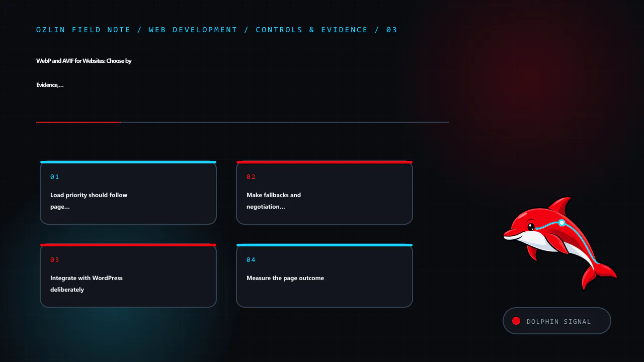
Measure the page outcome
Compare transferred bytes, image request timing, LCP, layout stability and visual quality before and after. Segment cold and warm cache, mobile and desktop and relevant regions. A successful change reduces cost or delay without adding artefacts, broken fallbacks or editorial friction.
Do not promise a fixed performance or search-ranking improvement from a format switch. Images may not be the limiting resource, and search outcomes depend on many factors outside the codec.
For help auditing a WordPress media pipeline or responsive image implementation, see Ozlin Info's web development services or contact Ozlin Info.
Related reading: Web performance: diagnose real user experience before optimising.
General-information disclaimer
This article provides general technical information only. Image quality, compatibility and performance must be tested against the actual assets, encoder, browser matrix, devices and delivery stack.
AI-assistance disclosure
AI tools assisted with source discovery, outlining and copyediting. A human reviewer must verify the encoding guidance, markup, compatibility, WordPress behaviour, service claims and publication decision before release. No byte saving, ranking or performance outcome is guaranteed.
Primary sources checked
- web.dev — Choose the Right Image Format
- Google — An Image Format for the Web
- Google — WebP Frequently Asked Questions
- MDN — The Picture Element
- MDN — Image File Type and Format Guide
Source access date: 29 August 2026.
Leave a Reply